Support Platform for Device Mapping & Fail-over
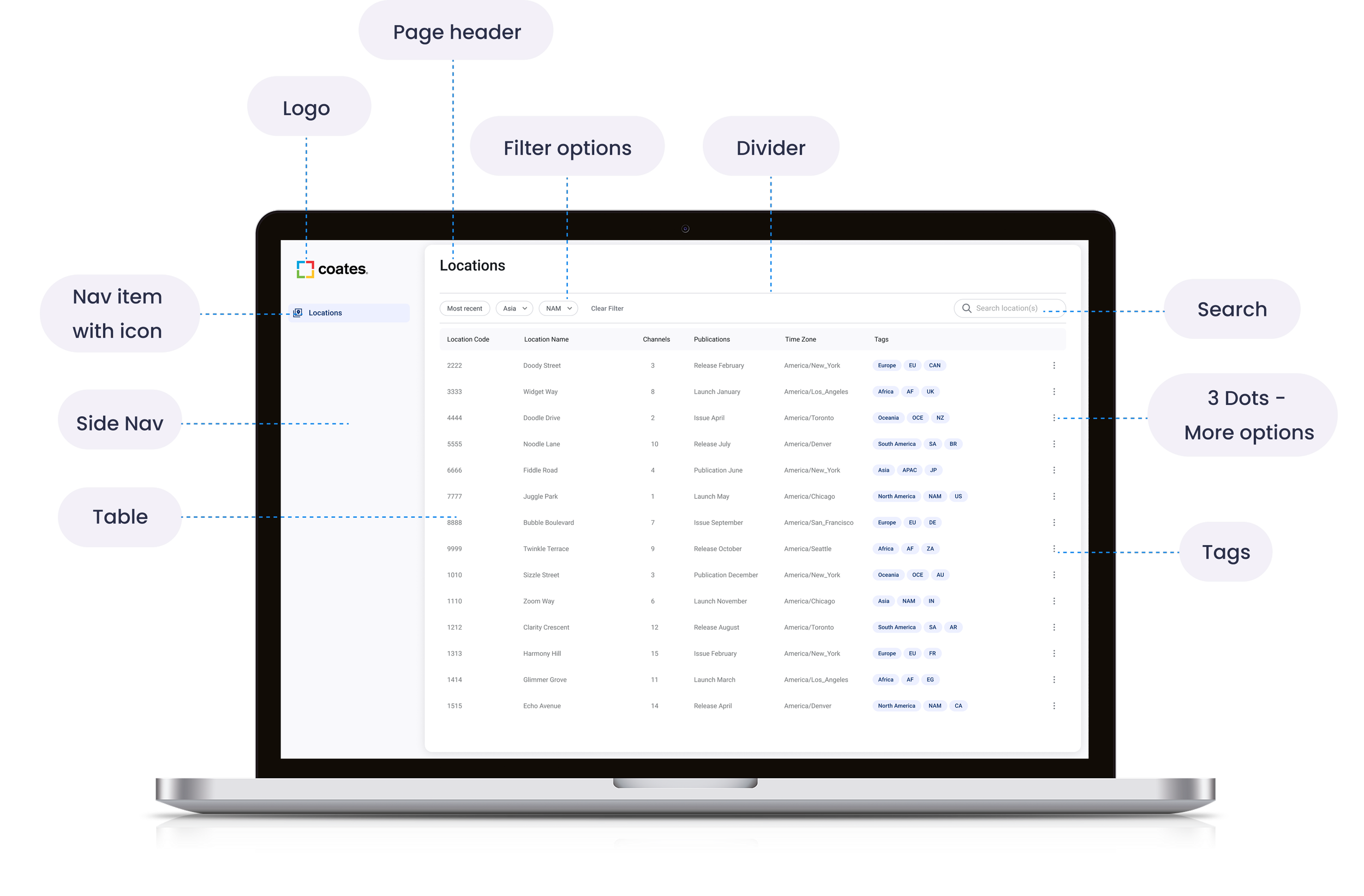
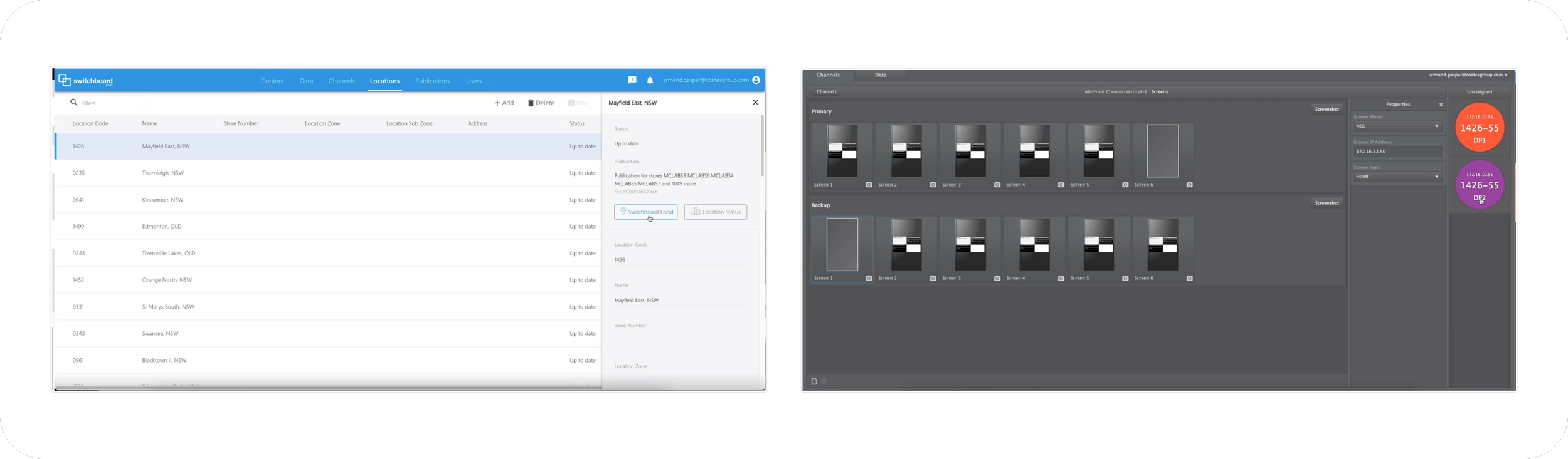
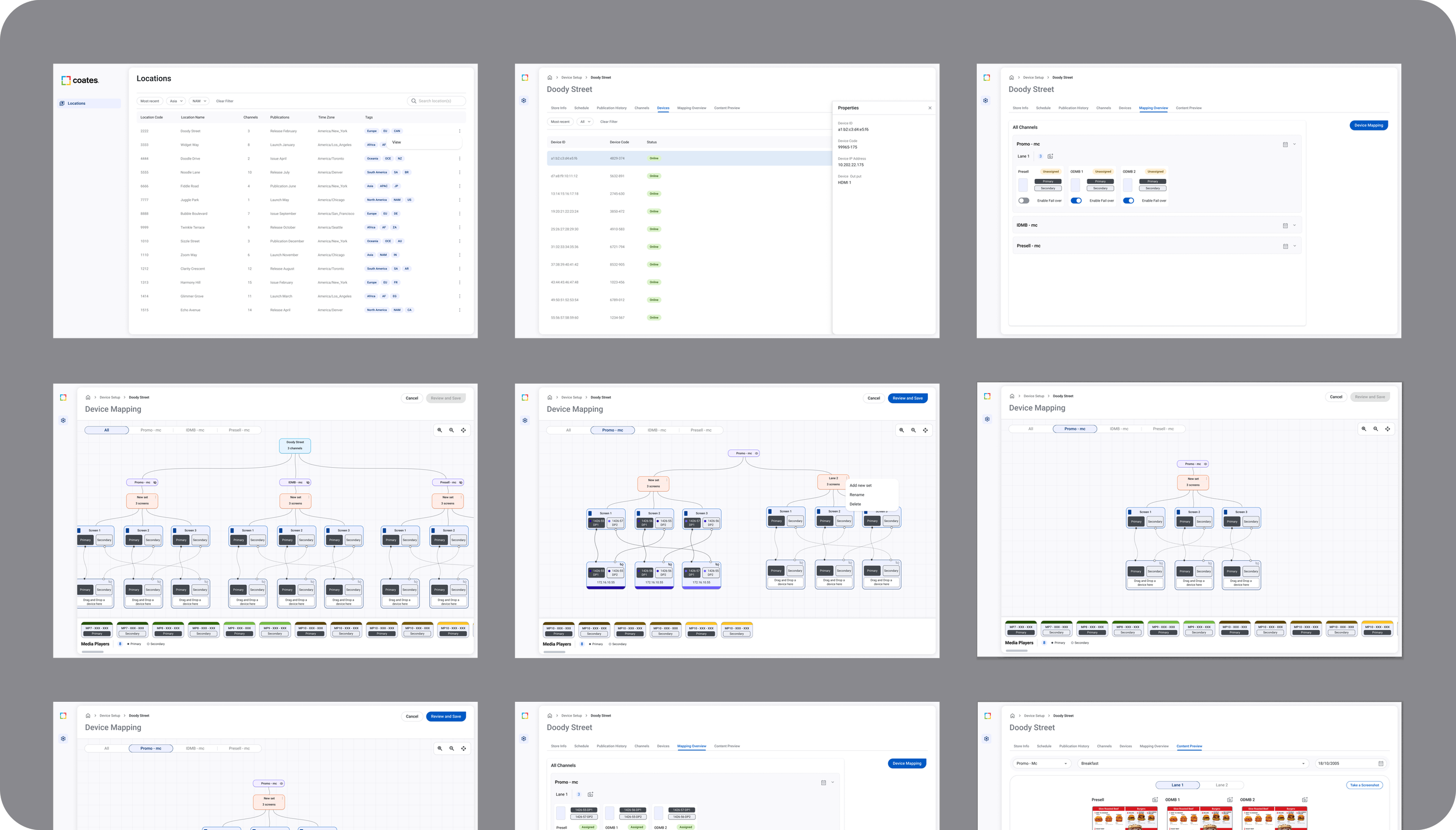
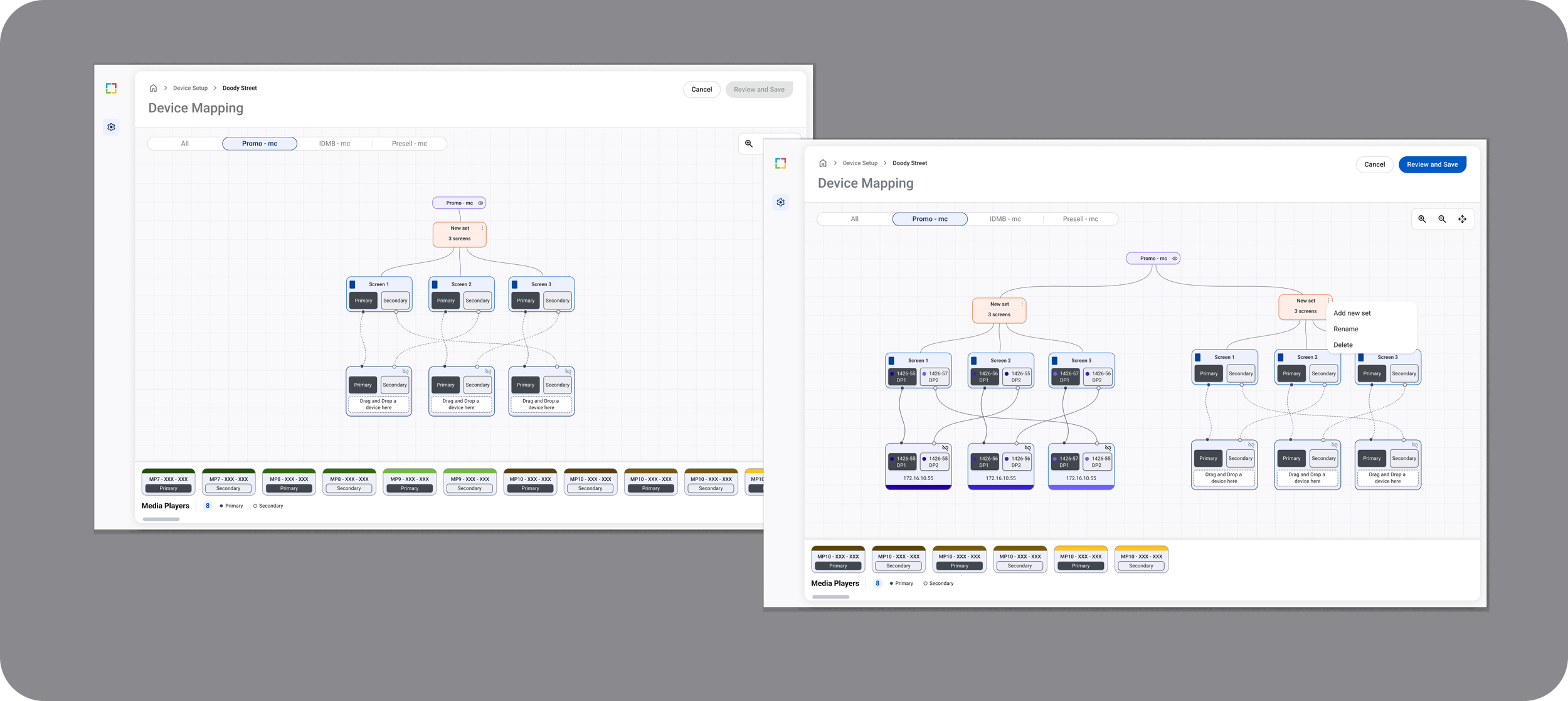
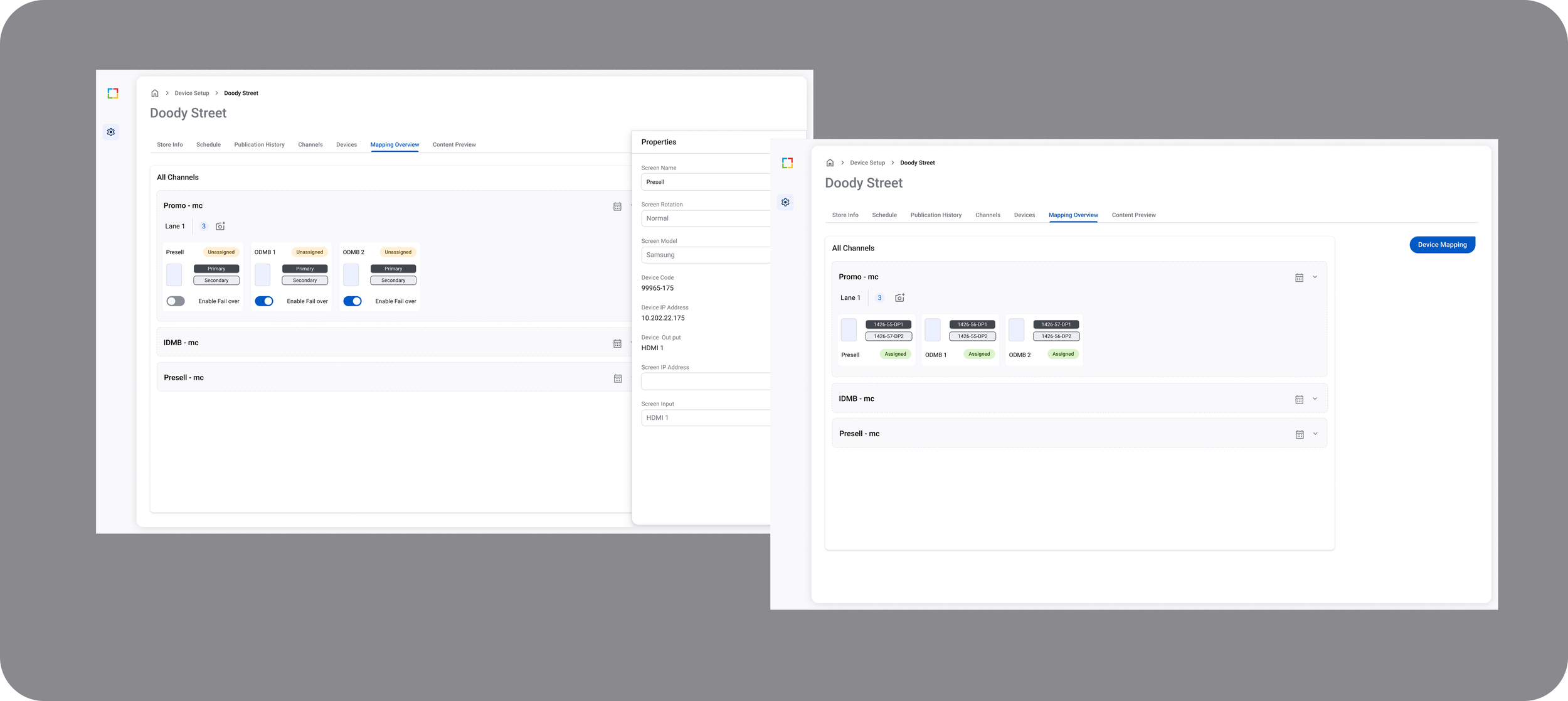
Device mapping dashboard: visualizing relationships between media players, screens, and inputs
2025 | User Research, User Testing, Product Design
Figma, FigJam, Jira
Focused on visual hierarchy, layout, and clarity to support dense interfaces
Project Overview
Support engineers were struggling with diagnosing issues across complex restaurant digital signage systems. The existing tool lacked clarity around how devices map to screens, inputs, and locations, leading to slower troubleshooting and frequent errors.
Role: Senior Product Designer
Team: Support Engineering, Product, QA
Platform: Internal web application
Users & Challenges
Primary Users:
Support engineers
Technical escalation teams
User Problems:
No single view showing device + screen + input relationships
Frequent misconfigurations due to disconnected data
Heavy reliance on tribal knowledge
Understanding the Problem
To truly understand the pain, I have done the following
Conducted user interviews with support engineers
Shadowed real troubleshooting sessions
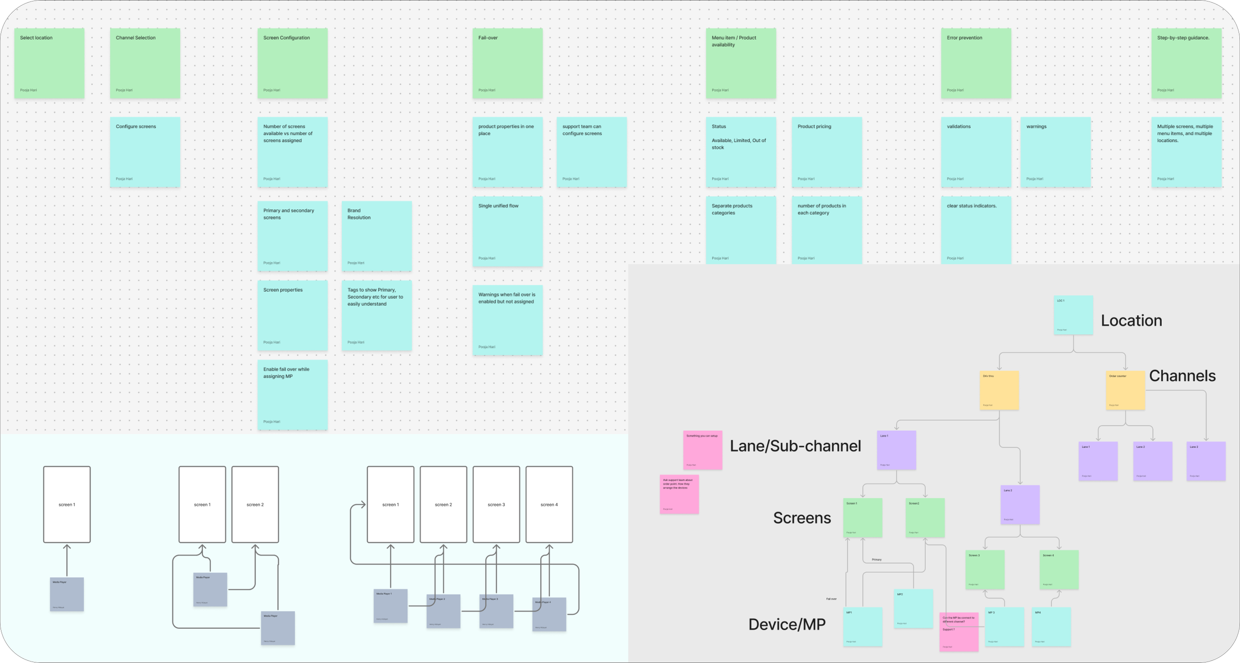
Mapped out the complex device hierarchy
Key Insight: Support engineers needed instant clarity, not more data.
Technical Constraints
Hardware behavior doesn’t always match expected logic
Failover logic differs per brand/store
Limited engineering capacity for new backend endpoints
Needed to scale to thousands of devices across global partners
State mismatch between UI and hardware could not be allowed.
What I Did
Mapped existing workflows with Support Engineering
Built system diagrams to reflect back-end + hardware logic
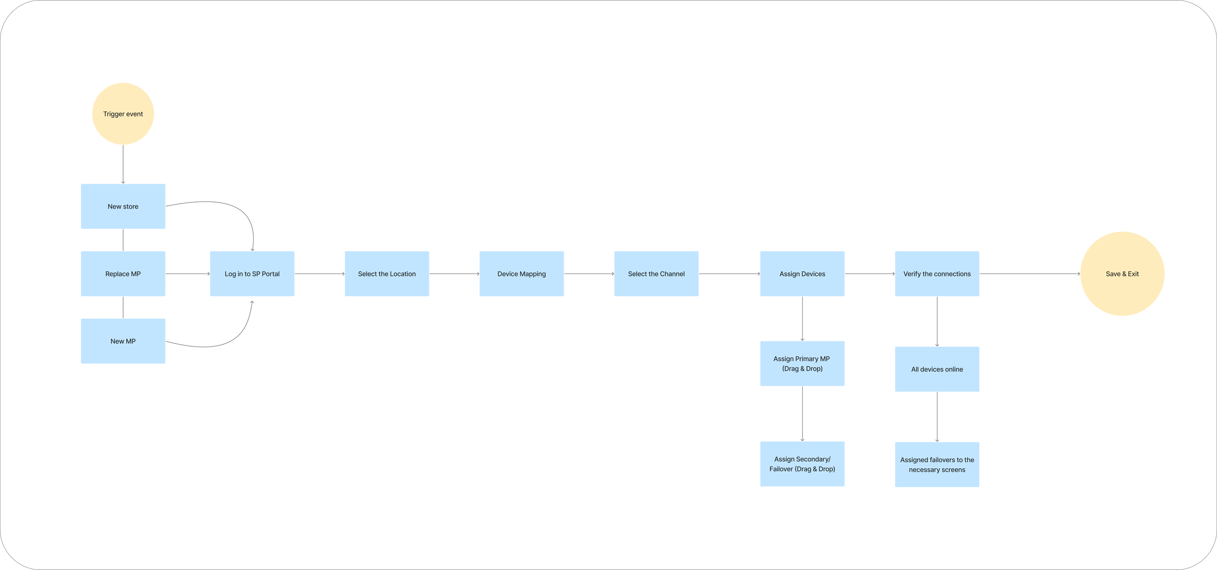
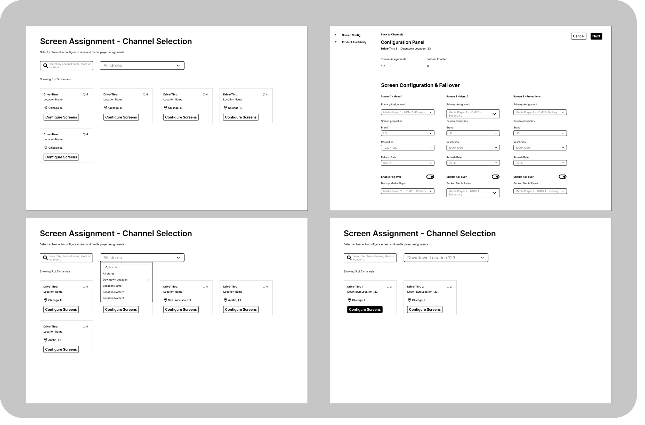
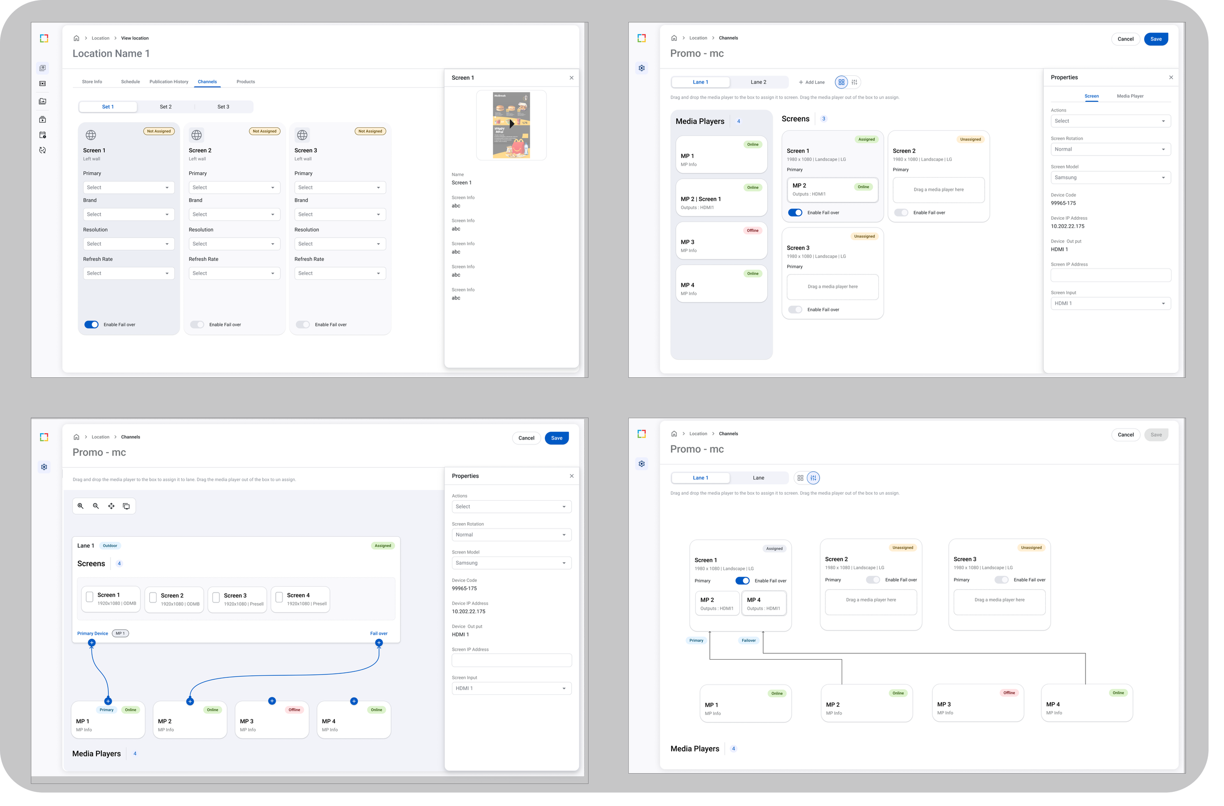
Created a unified mapping model (MP → Port → Screen)
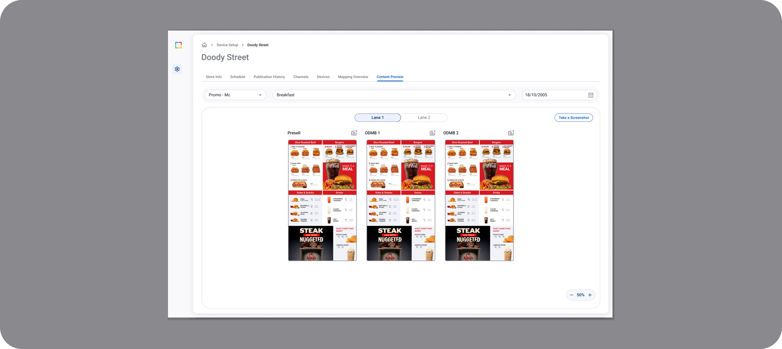
Added content preview to reduce errors
Standardized UI patterns for device states
Simplified flow for commissioning/mapping / fail-over
Design Process
Discovery
Mapped existing workflows
Defined key scenarios
Ideation
Created concept sketches for system visualization
Design Explorations
Prototyping
Built interactive prototypes to test mapping logic
Validation
Usability testing with engineers
Iterated based on feedback
Key Design Decisions
Hierarchy-first layout: Redesigned UI to show relationships instead of tables
Status badges & warnings: Clear color indicators to highlight issues
Inline help tooltips: Contextual help for complex terms (e.g., channels vs inputs)
Table navigation: Reduced clicks by consolidating views
Outcome & Impact
Reduced troubleshooting time by ~30%
Support confidence improved significantly
Fewer escalations due to clearer UI
Challenges & Learnings
Designing for complex systems is about making the invisible visible
Technical clarity reduces support costs
Cross-functional collaboration with Engineering + Support is crucial
UI must match real-world hardware behavior to be effective
Annotations/Labelling for Dev handoff
Created detailed annotations, labeled interactions, and structured documentation in Figma to standardize component usage, reduce developer ambiguity, and streamline handoff across CMS modules.