
UI Designer | 2020
Mobile Prototyping
Sketch, Marvel
Milano App - Local Activities & Sports Meetup Platform
Milano is a mobile application designed to help users discover, join, and organize local meetups easily. The goal was to create an intuitive and engaging interface that encourages in-person social interactions while maintaining a lightweight and fun experience.
My Role
I collaborated closely with the CTO and developers as the Product Designer, owning:
UX flows
Wireframes
High-fidelity mobile UI
Design system and visual direction
Interaction patterns
Developer-ready design documentation
My focus was to ensure a clear, polished mobile experience that was simple for newcomers and delightful for frequent users.
Problem
People who want to join local activities—especially sports meetups—struggle to find events happening nearby. Existing platforms feel cluttered, outdated, or overly generalized. Users needed a simple, clean, and location-aware app where they could easily:
Discover activities happening around them
Register for local events
Join sports meetups
Connect with people who share similar interests
Milano’s goal:
Create a local meetup app designed around simplicity, proximity, and seamless event discovery.
Users
Primary Users
Young adults & working professionals looking for sports or hobby-based activities
Fitness & sports enthusiasts searching for local games, meetups, and group activities
People new to a city want ways to meet others nearby
Event organizers or sports groups who want to post activities
User Needs
A clean place to browse events
Trustworthy, real information
Ability to register quickly
Location-based discovery
Minimal noise or distractions
Goal of the Product
Build a location-aware meetup app focused on real, close-by activities
Keep the UI clean, modern, and easy to use
Allow users to easily find, join, and register for events
Make browsing sports activities simple and intuitive
Support organizers in creating events effortlessly
Provide a smooth mobile UX that feels premium and trustworthy
Mood Board

Discovery & Research
Goal: Understand user needs, competitors, and common pain points around local events and social meetups.
Activities:
Competitive analysis of Meetup, Bumble BFF, Eventbrite, and Facebook Events
Light user interviews to explore social meetup habits
Identified common frustrations: cluttered UI, too many steps to join events, and poor location relevance
User Flow & Information Architecture
Goal: Map out key interactions and ensure smooth navigation
Activities:
Defined core tasks: Discover → RSVP → Connect
Created user flows for:
Browsing events
Filtering by interest/location
Viewing event details
Joining or messaging a host
Built a simplified navigation: Home, Explore, Notifications, Profile
Branding / Logo / Design System


What I Did
1. Defined the core user flows
Browsing nearby events
Viewing activity details
Registering for an event
Creating an activity
Viewing saved events
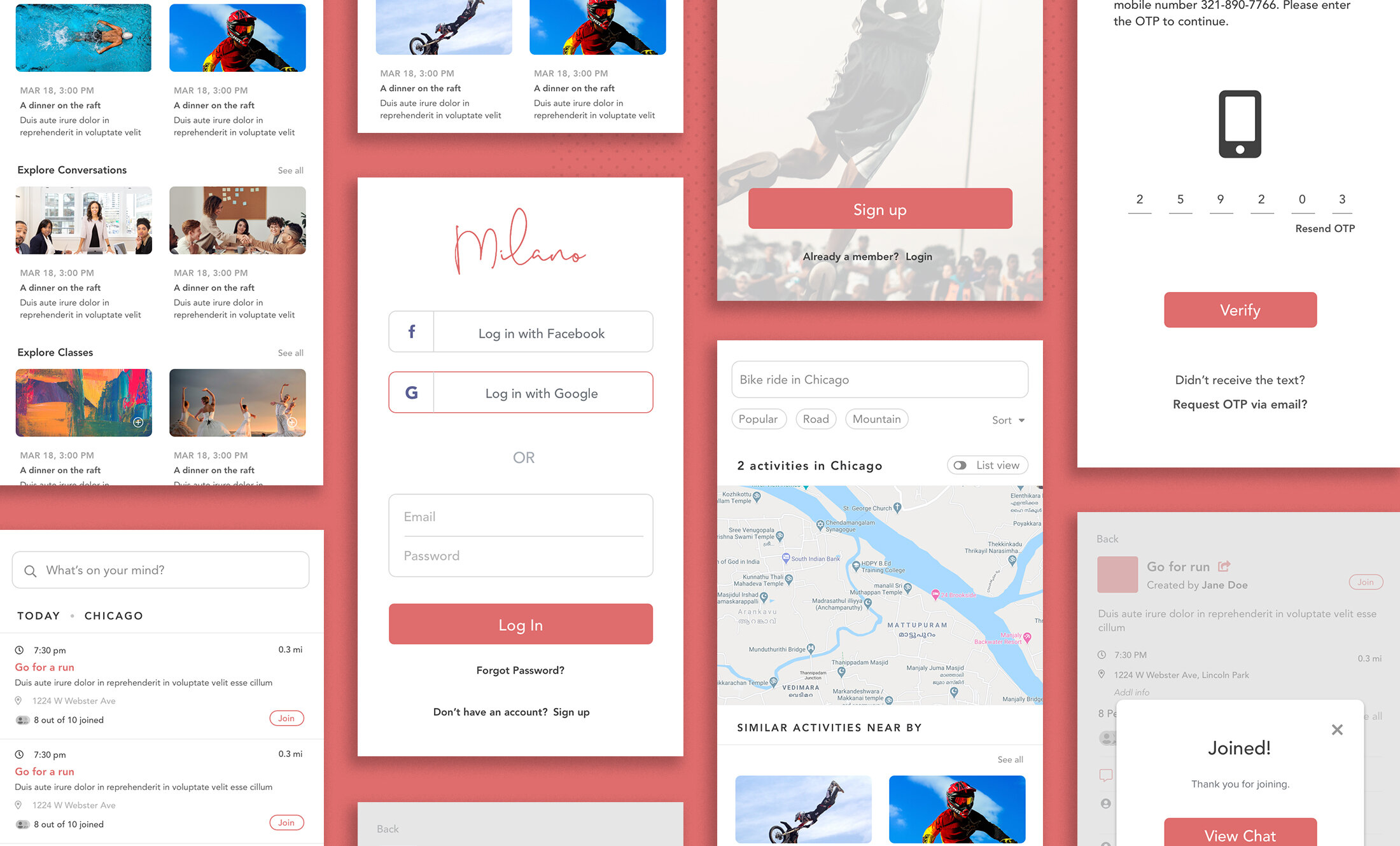
2. Designed wireframes
Low-fidelity screens to explore navigation patterns, layout spacing, card hierarchy, and how events should be visually grouped.
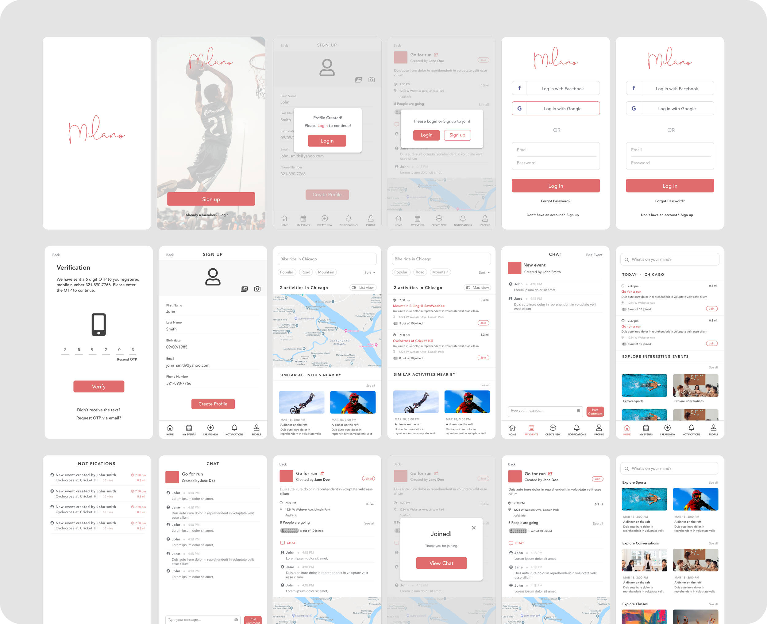
3. Created high-fidelity UI
A minimal, modern aesthetic with:
Clean typography
Soft visual hierarchy
Easy-to-scan activity cards
Clear CTAs
Strong UX patterns for browsing + signing up
4. Collaborated with developers
Ensured feasibility
Provided component specs
Iterated based on technical constraints
Delivered assets and motion guidance
Wireframes
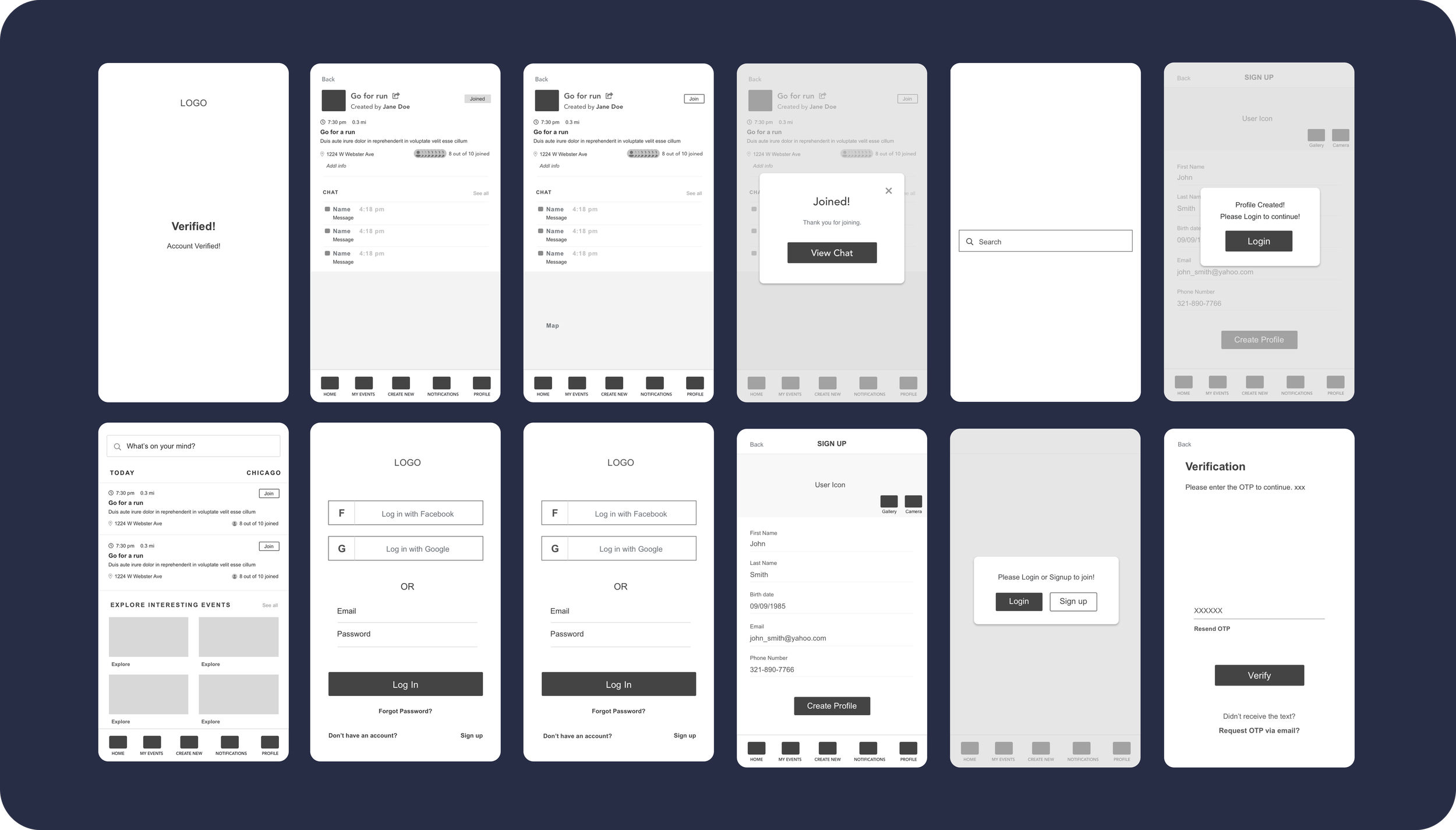
Final Designs
User Testing & Feedback
Goal: Validate design with real users before development
Activities:
Conducted lightweight usability testing with 4 local users
Key feedback:
Map view was helpful but needed to be the default view
Users wanted quicker RSVP confirmation
Suggested clearer call-to-actions and labels
Iteration & Final Design
Goal: Improve usability based on testing insights
Activities:
Simplified RSVP flow to one tap
Made map view the default in Explore tab
Adjusted button sizes and added clearer action icons

