
UI Modernization for an Enterprise Internal Platform
2021 | UI Design
Sketch, Zeplin, Jira, Trello
Problem
Polaris was a powerful internal tool used by multiple teams, but its interface had become outdated, cluttered, and difficult to navigate. Users struggled with:
Dense screens and inconsistent layouts
Old UI patterns that made tasks slow
No light or dark mode options
Elements that did not scale with expanding features
A lack of a cohesive design system across the product
The challenge was to modernize the experience, simplify workflows, improve readability, and create a flexible interface that could grow with the product.
Context
Polaris supported internal data operations and decision-making. Many users interacted with it daily, so small usability issues had a disproportionate impact on productivity.
The product needed:
A visual refresh
A cleaner, more intuitive layout
A unified design system
Scalable components
Better visual hierarchy for data-rich pages
My Role
As the Product Designer, I owned:
UX audits and heuristic analysis
Wireframes and redesigned layouts
High-fidelity UI for both light & dark mode
Establishing and maintaining a design system in Sketch
Collaboration with the CDO, CTO, and engineering
Delivering developer-ready handoff files
I acted as the bridge between product leadership and engineering, ensuring design decisions aligned with both feasibility and long-term scalability.
Users
Primary Users:
Operations teams
Internal analysts
Product and support teams
User Needs:
Clean data presentation
Reduced cognitive load
Clear navigation
Consistent UI patterns
Dark mode for extended daily use
User Sign Up

User Register / Login
What I Did
1. Conducted a UI/UX audit
Identified inconsistencies
Mapped friction points
Highlighted areas with poor readability
2. Created wireframes for improved layouts
Simplified navigation
Introduced visual hierarchy
Reorganized key sections for clarity

3. Designed high-fidelity mockups
Modern, clean interface
Better spacing, padding, and typography
Componentized UI elements
4. Designed both light and dark modes
Ensured visual balance
Adapted color tokens for accessibility
Created a mood-appropriate UI for different work environments
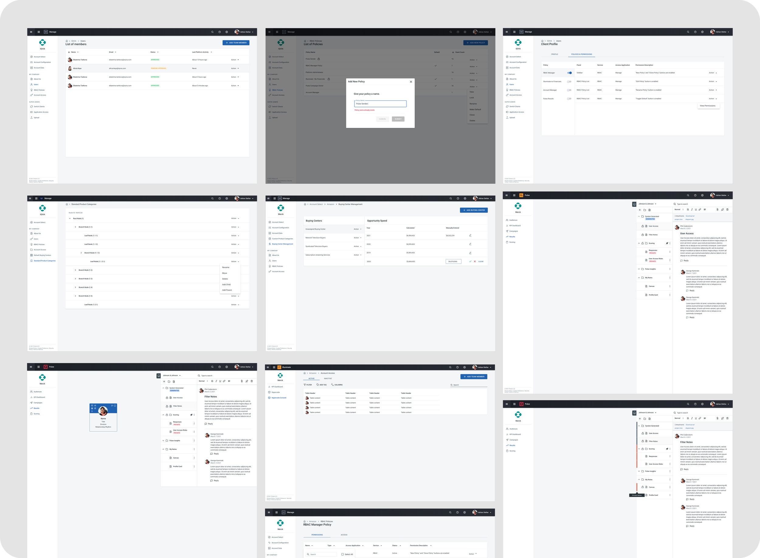
5. Built and maintained the design system
Component library in Sketch
Button styles, typography scales, card patterns, tables, forms
Tokens for light/dark mode
Documented usage guidelines
6. Collaborated with CDO, CTO & developers
Weekly check-ins to validate requirements
Adjusted designs based on tech constraints
Delivered pixel-perfect assets
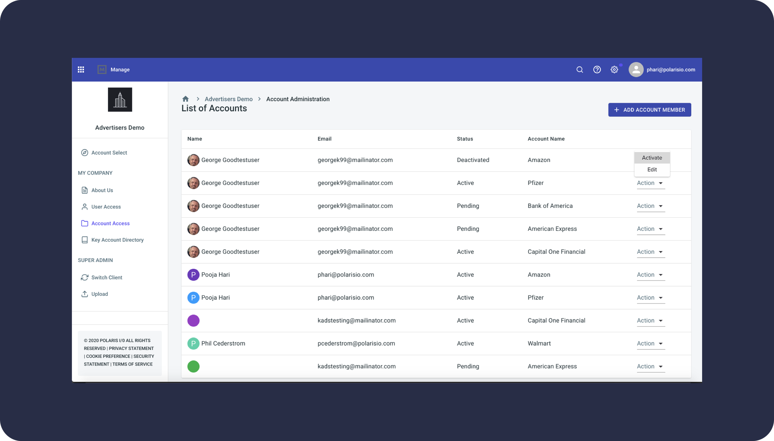
Old vs New Designs
Old Design
Cluttered screen layouts
Inconsistent spacing
Outdated colors and icons
Dense, hard-to-read data tables
No visual hierarchy
New Design
Modern, minimal visual language
Clear separation of content
Improved data readability
Refined spacing + typography
Scalable components from the design system
Light & dark mode versions
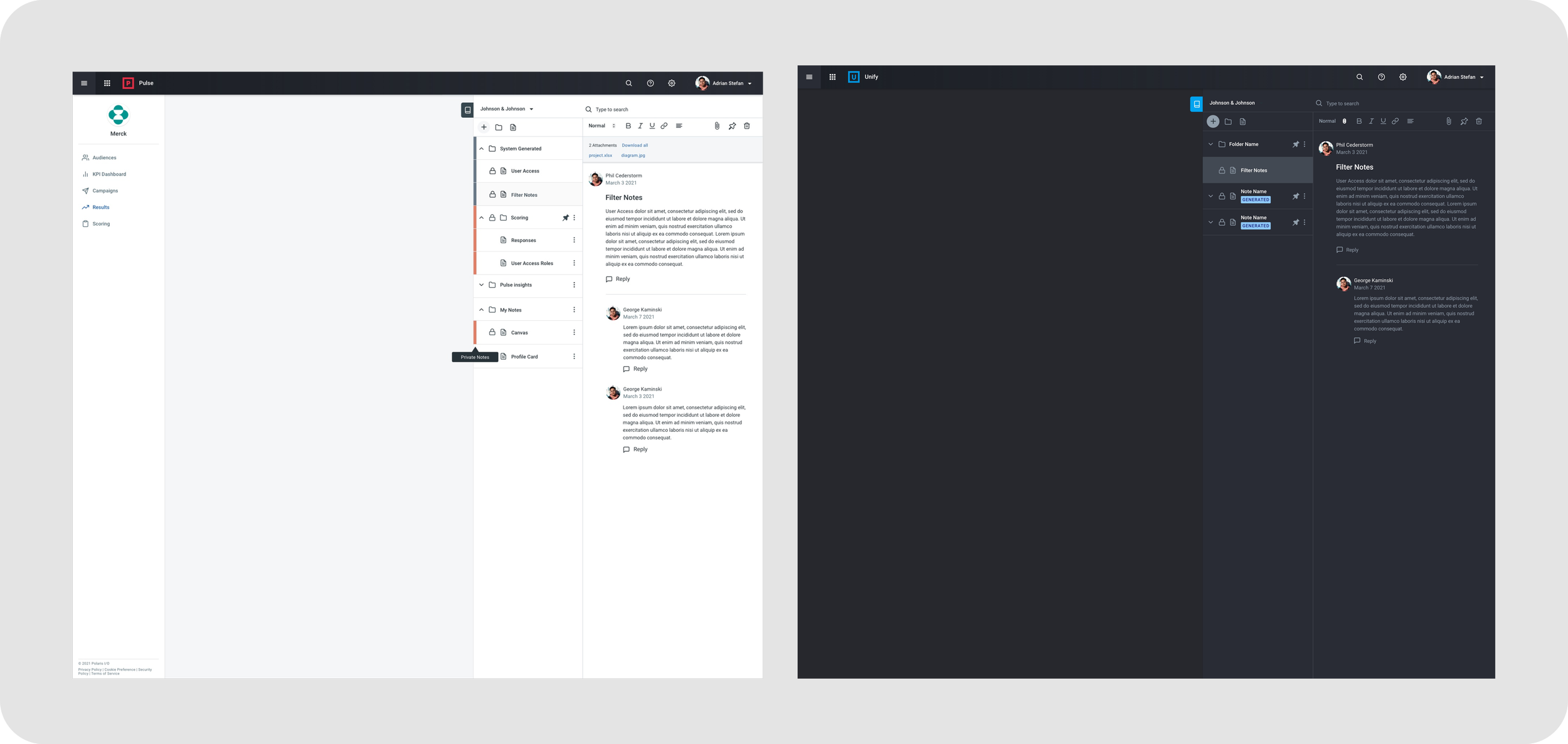
Notebook - Custom Design
Old Design / Wireframe


New Design / Mockup
Custom Features
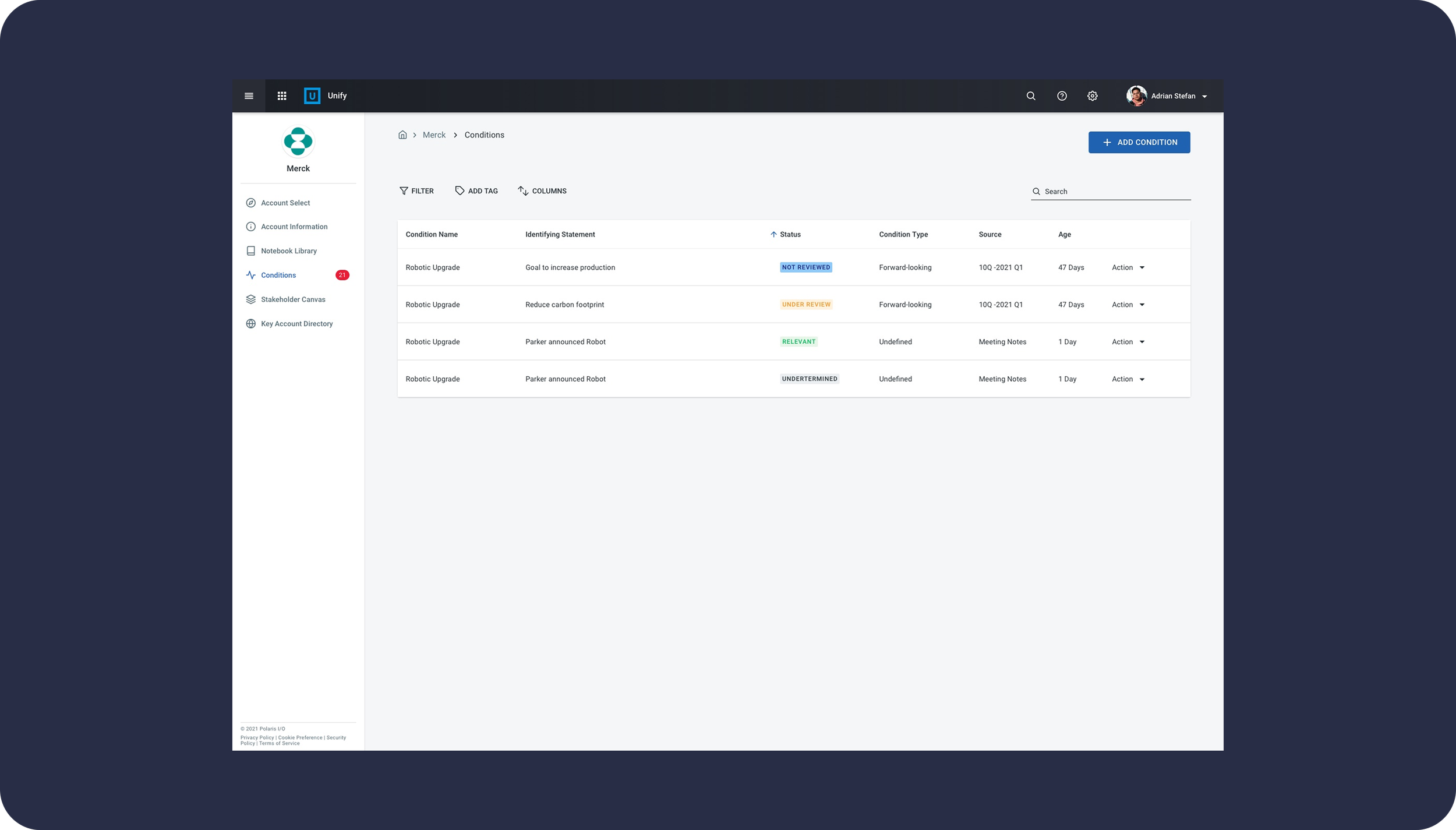
Stakeholder Canvas - Custom Design
Old Design / Wireframe


New Design / Wireframe
Light & Dark Mode Design
Light Mode
Clean, bright interface
Soft neutrals to reduce noise
Strong accent colors for clarity
Dark Mode
High contrast for long sessions
Accessible color ratios
Calm, focused environment for data-heavy tasks
Outcome
The redesigned Polaris system resulted in:
A significantly improved user experience
Faster task completion due to clearer layouts
Consistent UI patterns across all modules
A fully documented design system for scalable future development
Higher satisfaction among internal teams
Reduced UI-related engineering effort
What I Learned
Even small visual inconsistencies compound over time in internal tools
Light and dark modes must be built from the ground up with tokens
Early collaboration with engineering ensures smoother implementation
A design system is essential for long-term maintainability
Internal tools deserve the same level of polish as customer-facing product
Screen Animation
Created an animation to show the course completion process for our upcoming Learning Center App.
